Smarter loan origination and distribution powered by automation and AI-driven technology.
-
Global leaders in loan origination automation, MQube was established in 2016 with a clear ambition: to make the process of originating and distributing loans better for everyone involved. Leveraging cutting-edge automation and AI-driven technology, MQube provides both lenders and borrowers with increased speed, certainty, and control throughout the loan application process. This innovative approach not only enhanced the overall experience but also improved outcomes, setting a new standard in the lending industry.
-
MQube required a comprehensive brand refresh to better align with its evolving market position and competitive landscape. The project encompassed a full redesign of the company’s visual identity, including the development of a modern, cohesive logo and updated colour palette.
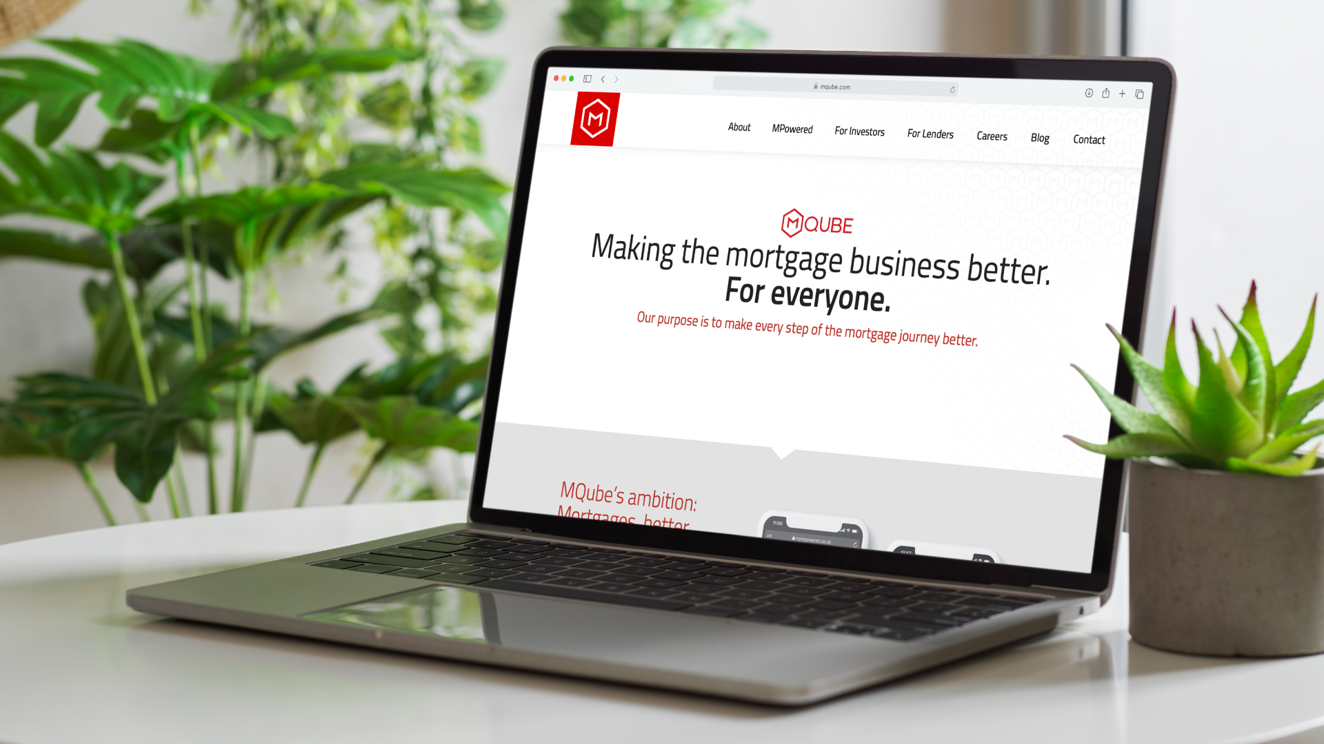
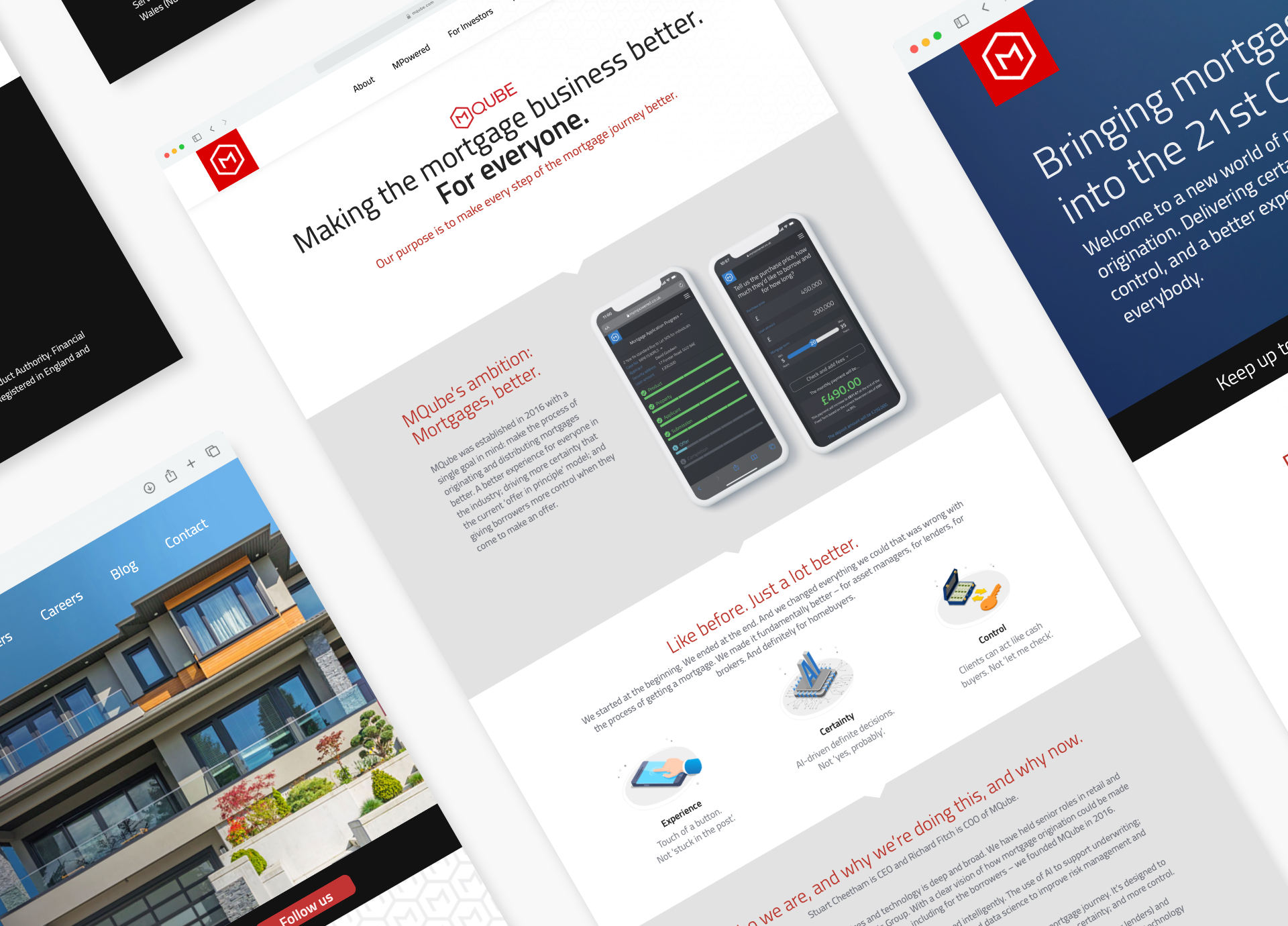
A new website was created to provide an intuitive user experience and clearly communicate MQube’s value proposition. The site was designed with responsive functionality to ensure accessibility across all devices.
In addition to the website, a variety of brand collateral was developed. This included a series of professionally designed slide decks and presentation contexts, enabling consistent messaging and a polished appearance.
Environmental graphics were produced to enhance physical workspaces, reinforcing brand recognition in real-world settings. Branded printed materials such as business cards, brochures, and stationery were created to maintain a uniform and professional image across all touchpoints.
The overall design and marketing collateral were crafted to be versatile and easily adaptable, supporting MQube in its ongoing promotional efforts and future growth initiatives.
-
As graphic designer, it was my role to bring all of this branded collateral together, ensuring each piece reflected the company’s high-quality standards, its cutting-edge technological focus, and its commitment to high output. Through careful selection of typography, colour schemes, and imagery, I aimed to create a cohesive visual identity that communicated professionalism and innovation. Every element was designed to resonate with the target audience, reinforcing the company’s position as a leader in its field while maintaining clarity and consistency across all media.


Establishing the Brand:
Creating a refined brand identity.
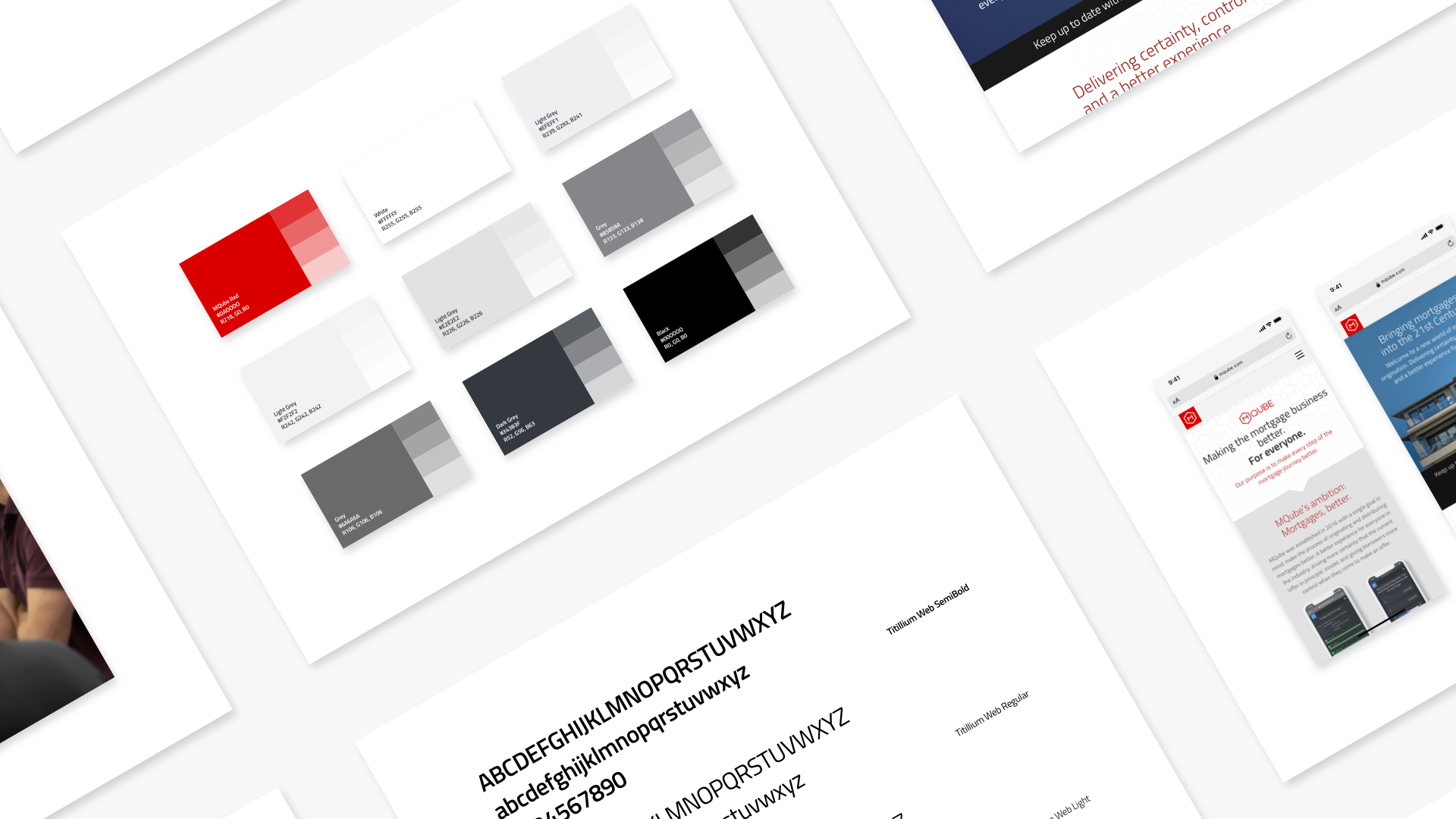
MQube initially had a logo and a very basic website, but one of the design team’s first priorities was to refine the brand identity by merging the two separate M’s into a single, clearer form. Early on, we conducted street interviews to gauge public perception, discovering that many passersby read the original logo as ‘M M Qube’ rather than ‘MQube.’ This insight confirmed the necessity of a redesign. After developing the new logo, we returned to the streets and were pleased to hear the desired response, ‘MQube.’
Impressively, this logo endures outside the company headquarters despite subsequent redesigns over the years. Beyond the logo, we crafted a cohesive brand experience, including a distinctive repeating pattern that features throughout the office environment, on glass walls and in slide decks, enhancing visual consistency. I personally developed comprehensive brand guidelines and a full suite of brand collateral, including business cards and employee materials, ensuring a high-value, unified brand presence that supports both internal culture and external recognition.


Web Design:
Simplifying mortgage journeys and building client trust.
The main aim of the company was to make the mortgage business better for everyone. In the early days of MQube, the team focused on iterating the website, building webpages, and carefully crafting the story and message they wanted to convey.
As the company evolved, MQube transformed into MPowered Mortgages, marking a significant stage in its lifecycle when these two identities coexisted. MQube was represented by a bold red branding, while MPowered adopted a pale blue colour scheme, symbolising the distinct yet connected phases of the company’s development.

Photography:
Showcasing MQube’s dynamic environment.
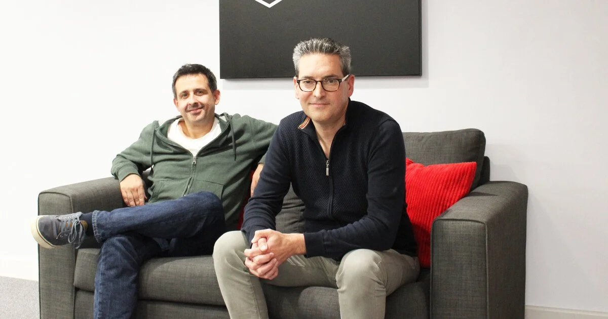
I took photography while at MQube, capturing a variety of moments and subjects that showcased the dynamic environment and activities. The photos I produced were later used across multiple platforms, including magazines, websites, social media, and other media outlets, helping to visually communicate the brand’s message and engage a broader audience effectively.
