Zone3 Marketing Campaigns
Here is a selection of marketing campaigns from my time at Zone3. These projects spanned various platforms and targeted triathletes. Each campaign was carefully crafted to enhance brand visibility, engage customers, and drive sales growth.
The Big Summer Sale
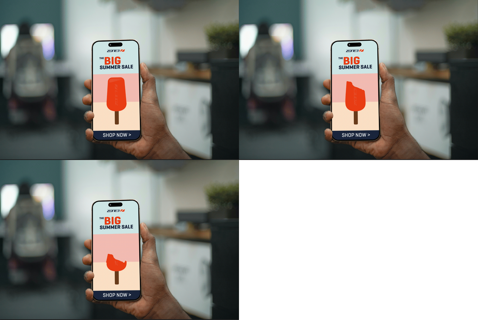
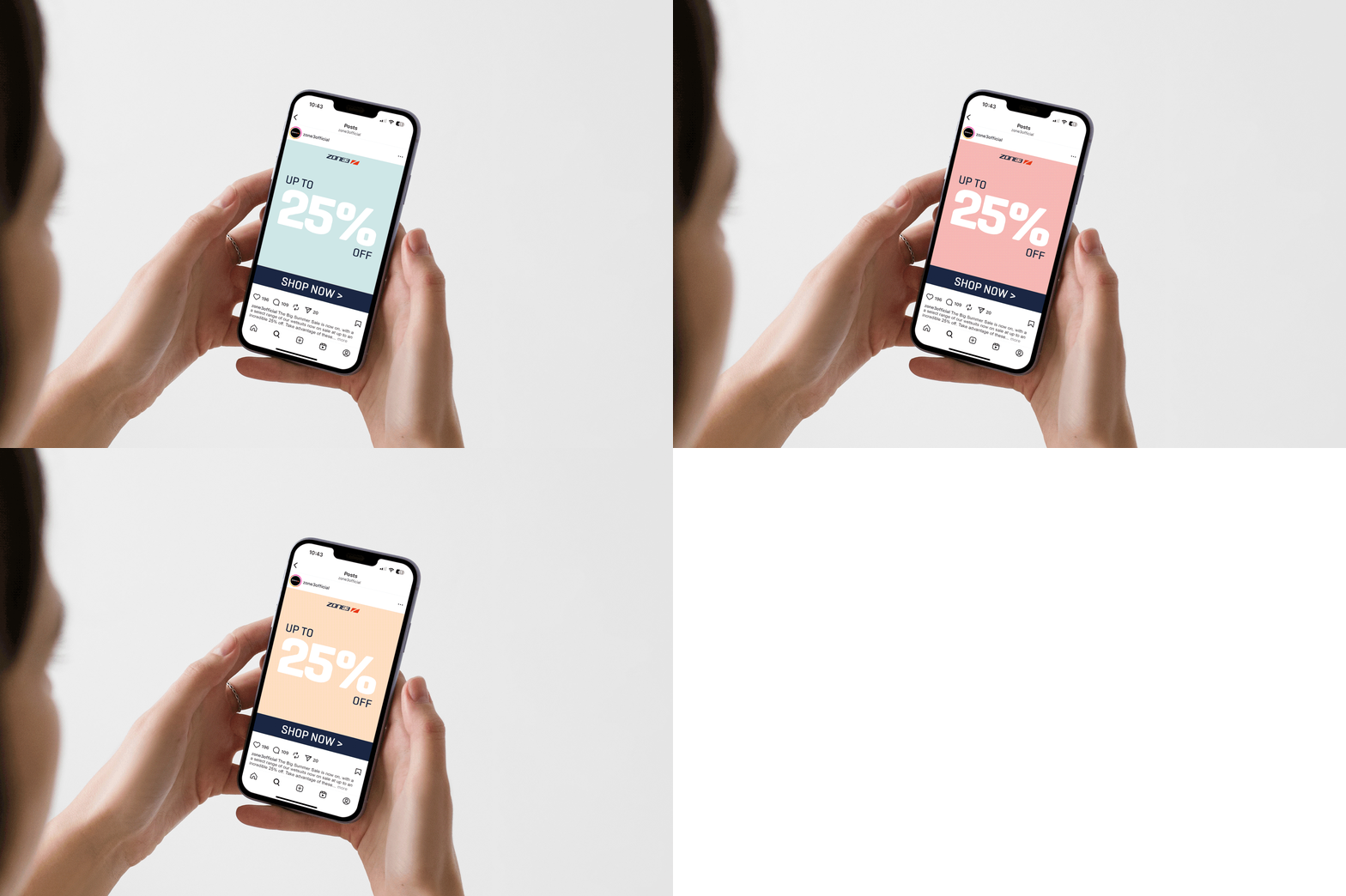
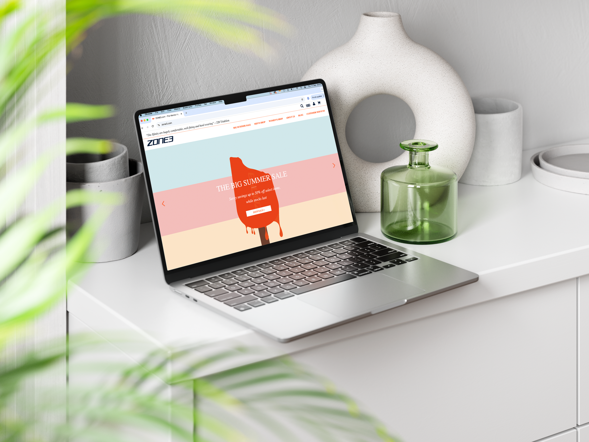
The Big Summer Sale was a marketing campaign offering up to 25% off a select range of Zone3 wetsuits. The style and colour scheme were determined by the Brand Manager, while I was responsible for creating the typography and a complementary graphic. I chose an ice cream graphic in the brand colours to evoke a sense of urgency and summer enjoyment, symbolising that stock was limited and once sold out, it would not be replenished. Additionally, I designed a new call to action using the brand’s colour palette to ensure consistency and draw attention effectively.

T7Design Black Friday Sale
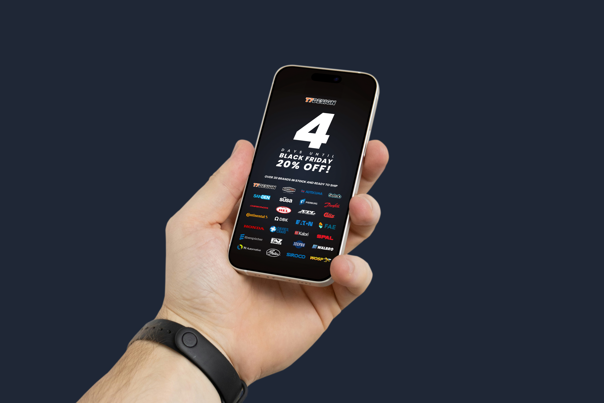
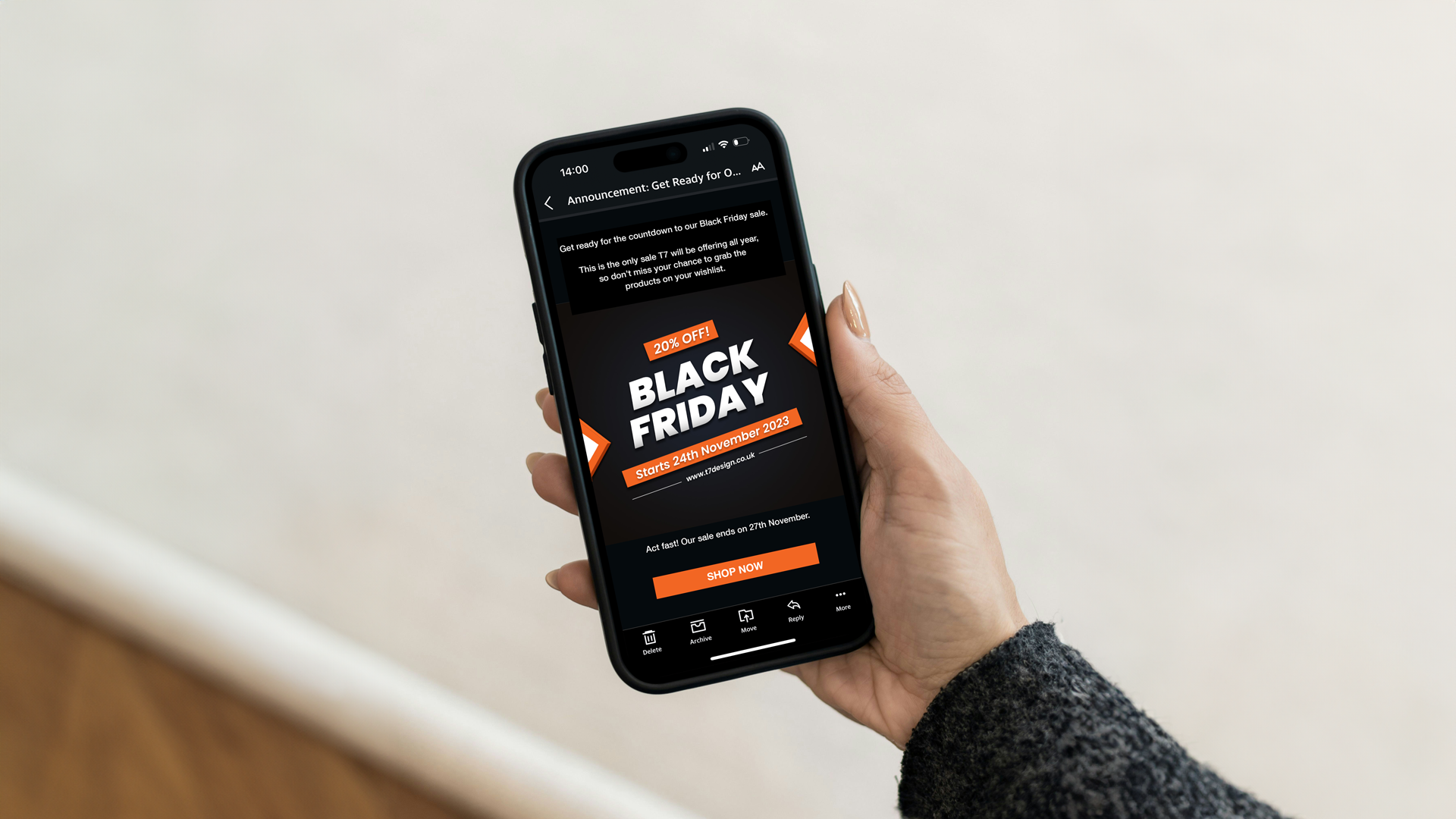
T7Design’s inaugural Black Friday Sale in November 2023 required a comprehensive promotional approach spanning social media graphics, website banners, and email campaigns. My role involved creating visuals that were consistently on brand, visually engaging, and strategically designed to drive sales during the key shopping period.
Uptake Rebrand
Uptake Strategies sought a brand refresh while retaining their trademark burgundy colour. I collaborated closely with the design team to develop a cohesive visual identity that honoured their existing brand heritage yet presented a modern, refined aesthetic.
Marketing Collateral
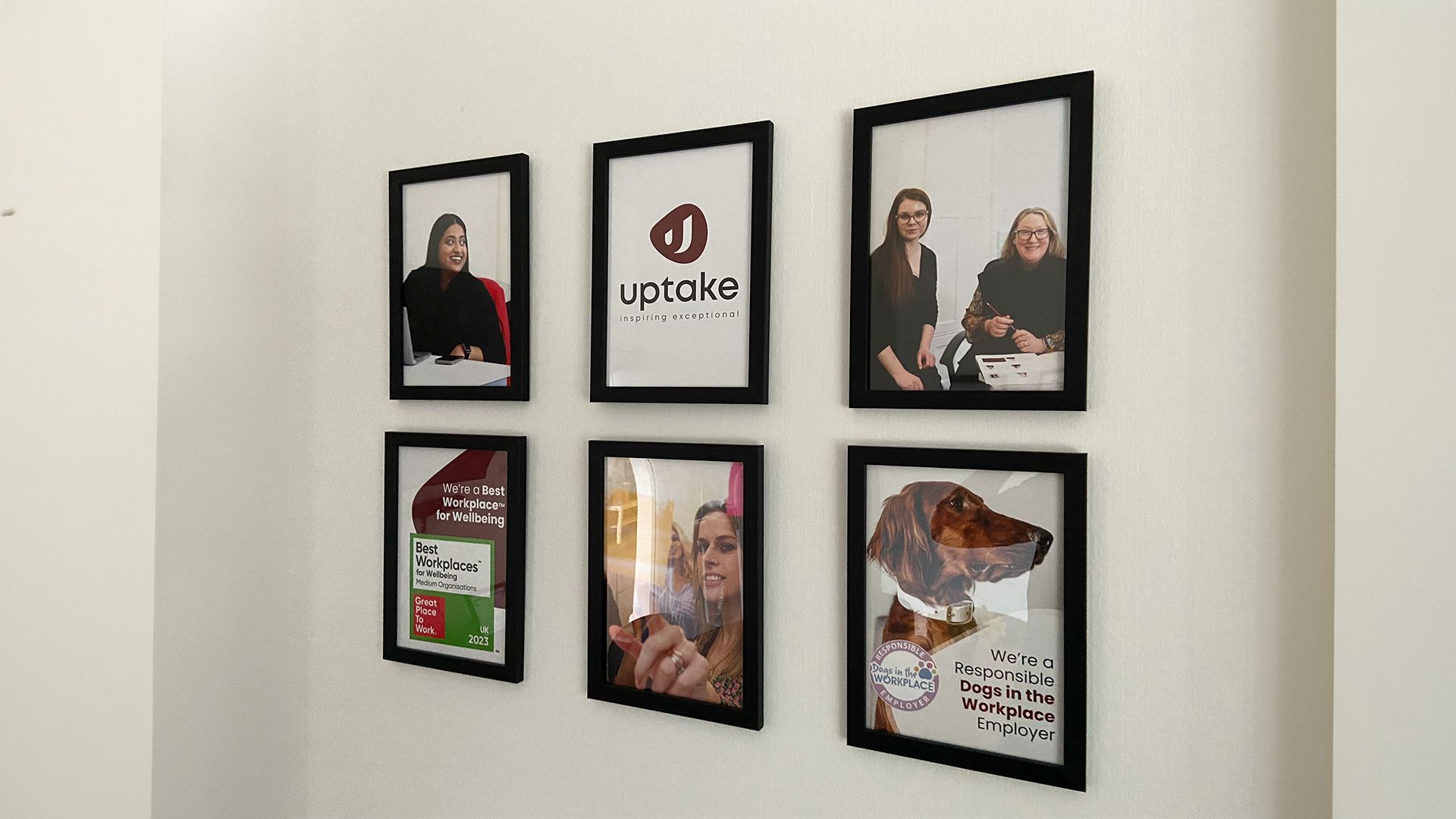
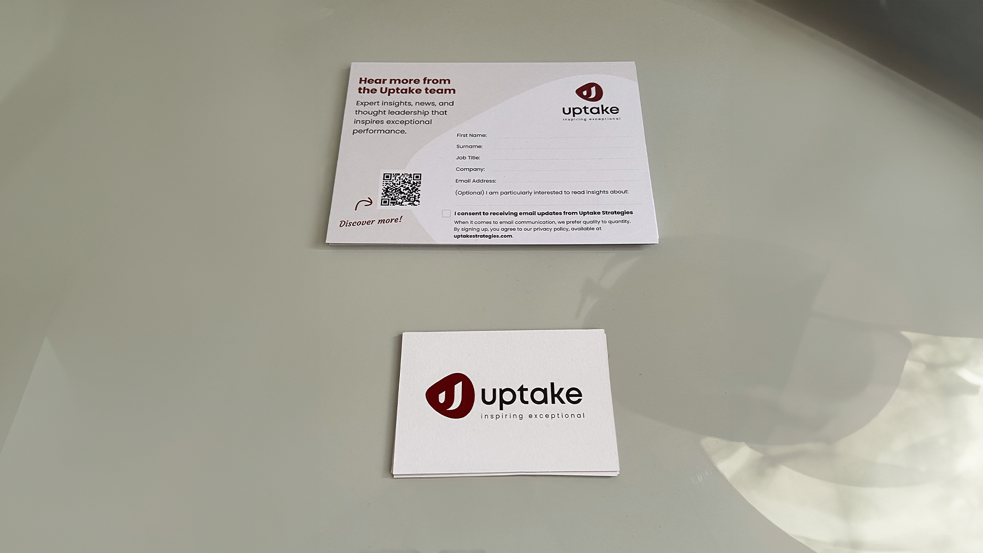
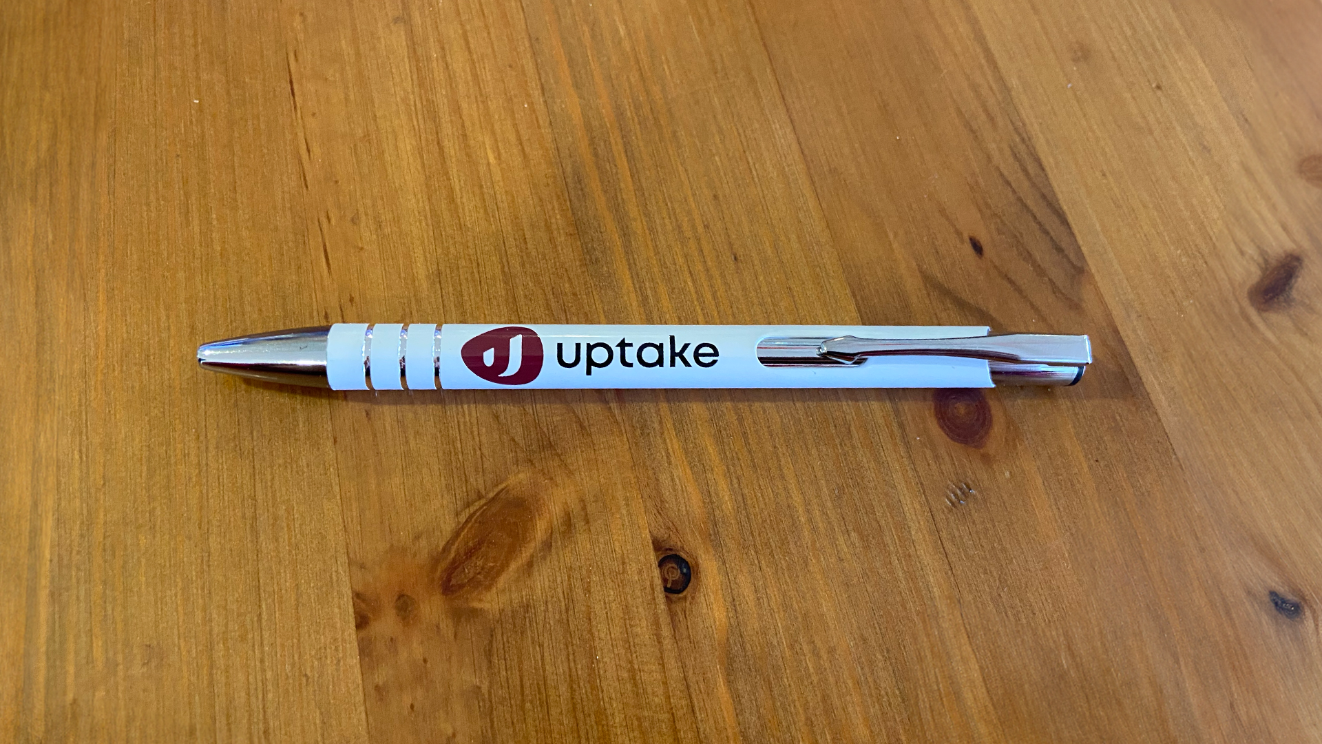
The project included designing an updated logo that balanced contemporary simplicity with recognisable elements from their previous mark. Beyond the logo, myself and the team created a comprehensive suite of brand collateral tailored to various touchpoints. This encompassed office decorations, including wall art and signage, as well as practical items like notebooks and pens that staff could utilise daily.
For external engagement, we developed event collateral including banners, table decorations, and giveaway items to ensure consistent brand presence at conferences and client meetings. My primary responsibility extended to crafting social media graphics aligned with the refreshed identity, enhancing Uptake Strategies’ online visibility and engagement.
In addition, I produced a series of internal pitch decks, designed to support the company’s business development efforts by clearly communicating their services and values in a visually engaging format. This multifaceted approach ensured Uptake Strategies presented a unified and professional brand experience both internally and externally.
We named the design team C3 studio, and is a collaborative effort.


Swimming with the Pros
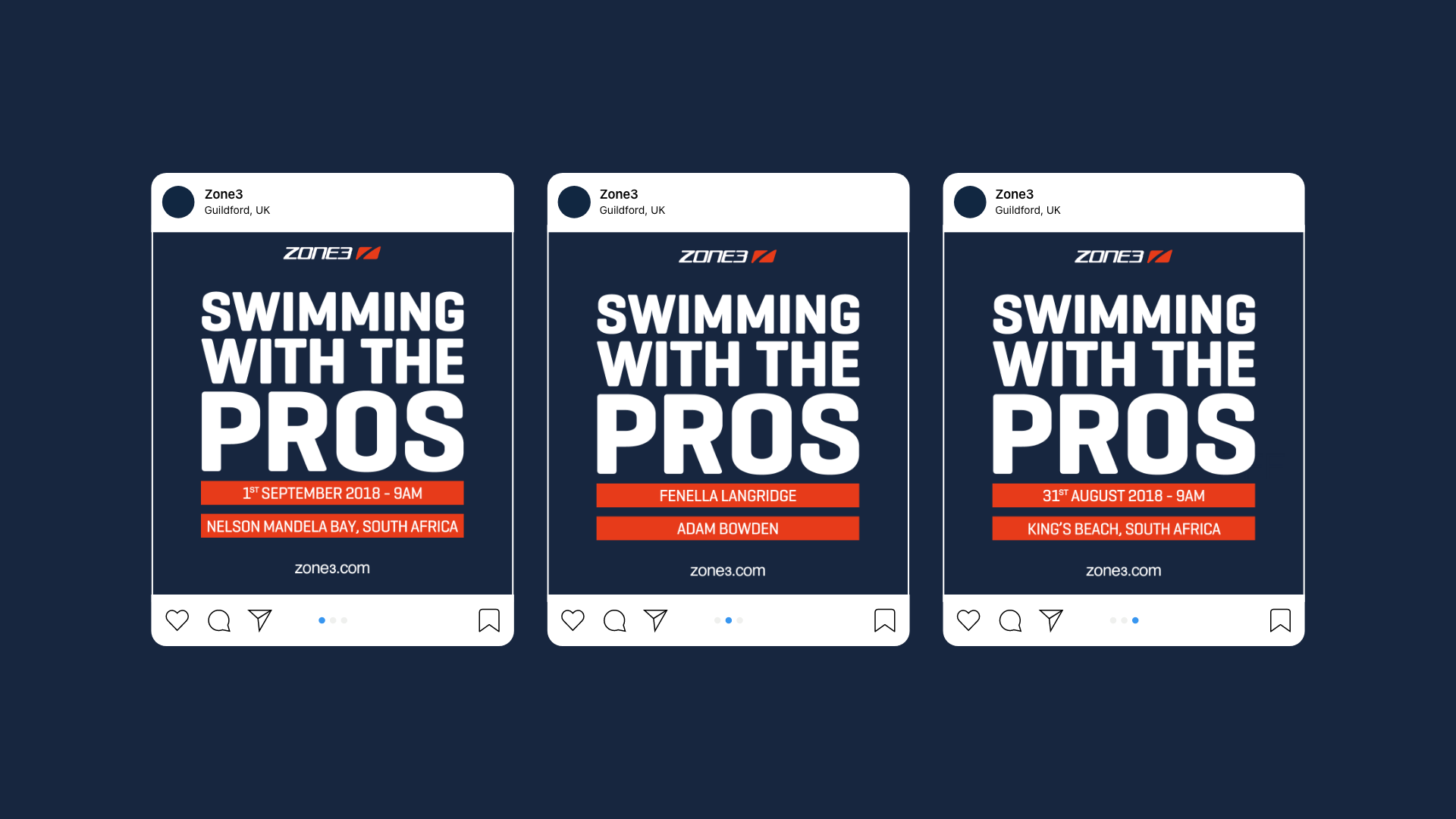
Swimming with the Pros was an event held in South Africa on 31st August and 1st September 2018. To promote the event on social media, I utilised the brand’s colours prominently, combining them with bold typography to ensure the messaging captured attention effectively. The location details were highlighted on an on-brand orange banner, designed to be eye-catching and easily recognisable, reinforcing the visual identity across all promotional materials. This approach helped create a consistent and engaging presence leading up to the event.

Ex-Demo Clearance
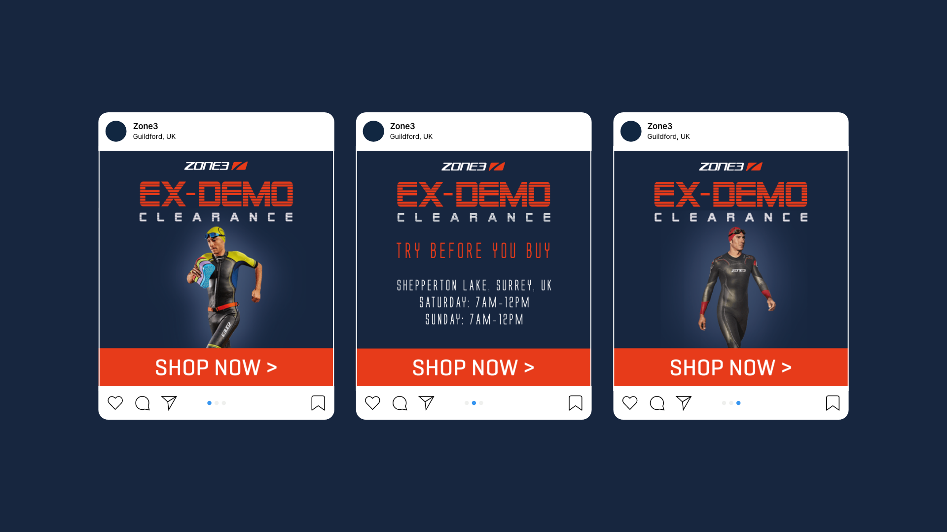
The Ex-Demo Clearance took place in early September 2018, offering wetsuits previously used in demonstrations at reduced prices. For this campaign, I was initially assigned to use an alternative font. However, I chose to maintain consistency by retaining the brand’s original colours, ensuring the visual identity remained aligned with the established aesthetic while highlighting the promotional aspect effectively.

Huge Prize Giveaway
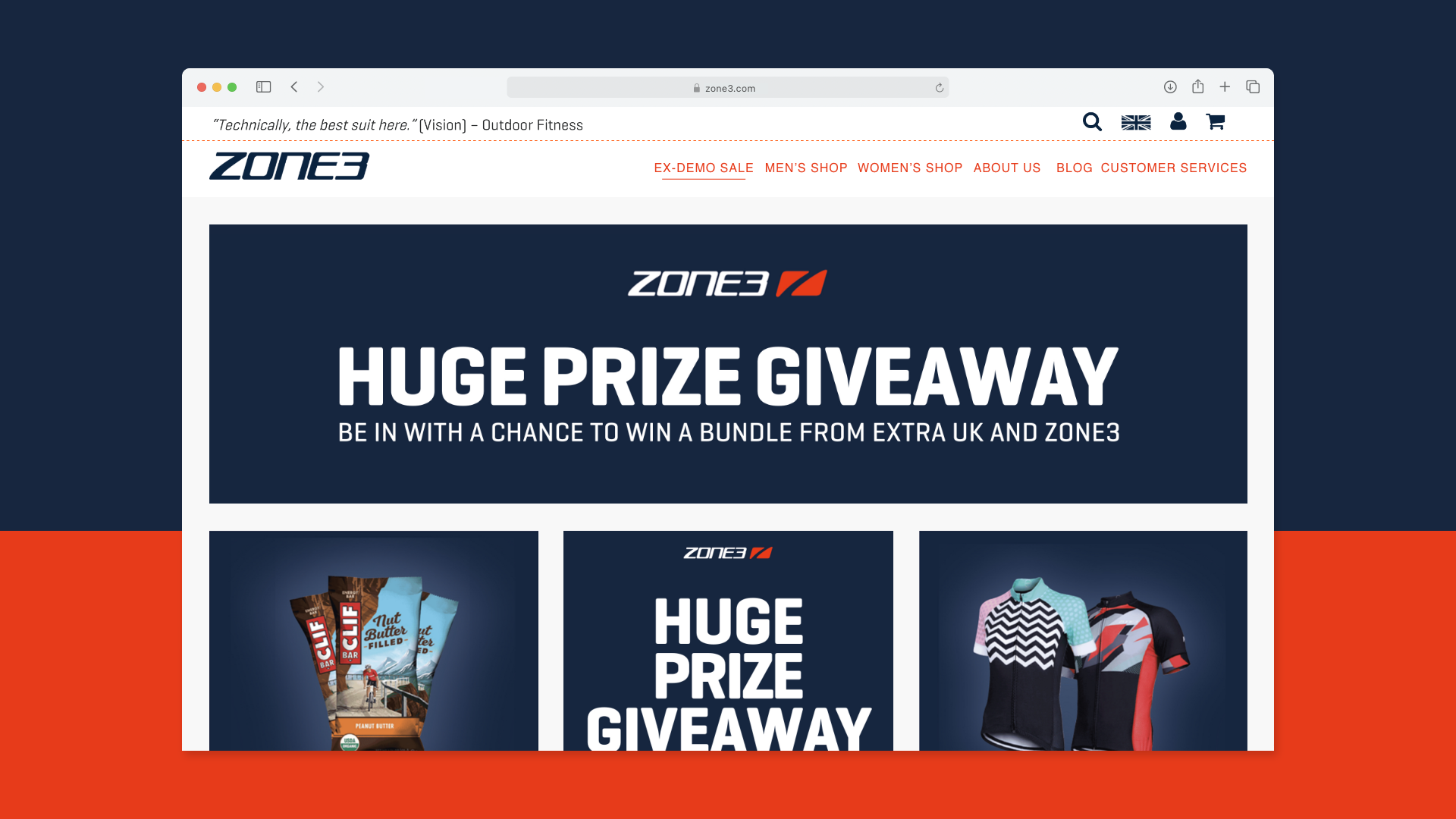
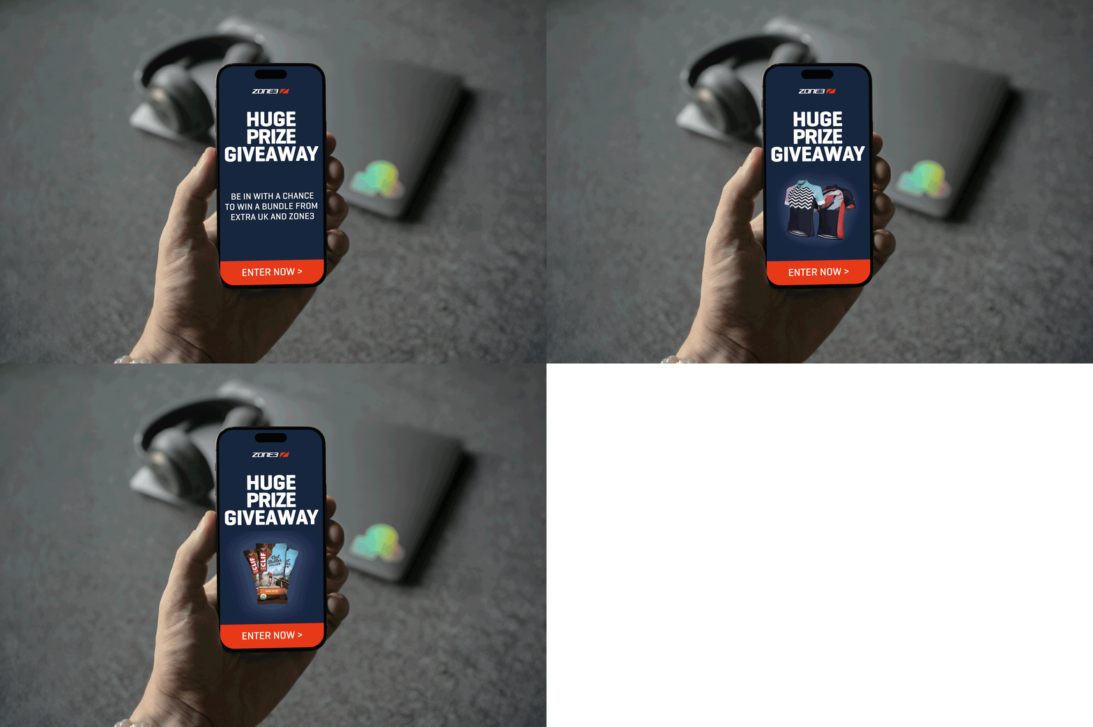
The Huge Prize Giveaway campaign was designed to attract new customers while rewarding existing ones through a select range of prizes. For this initiative, we deliberately returned to on-brand graphics and typography, ensuring consistency with our established visual identity. This approach reinforced brand recognition and trust, creating a cohesive and memorable experience for participants. By combining a clear, familiar aesthetic with enticing prizes, the campaign successfully engaged a broad audience and strengthened customer loyalty.
Black Friday ‘Blackout’ Campaign
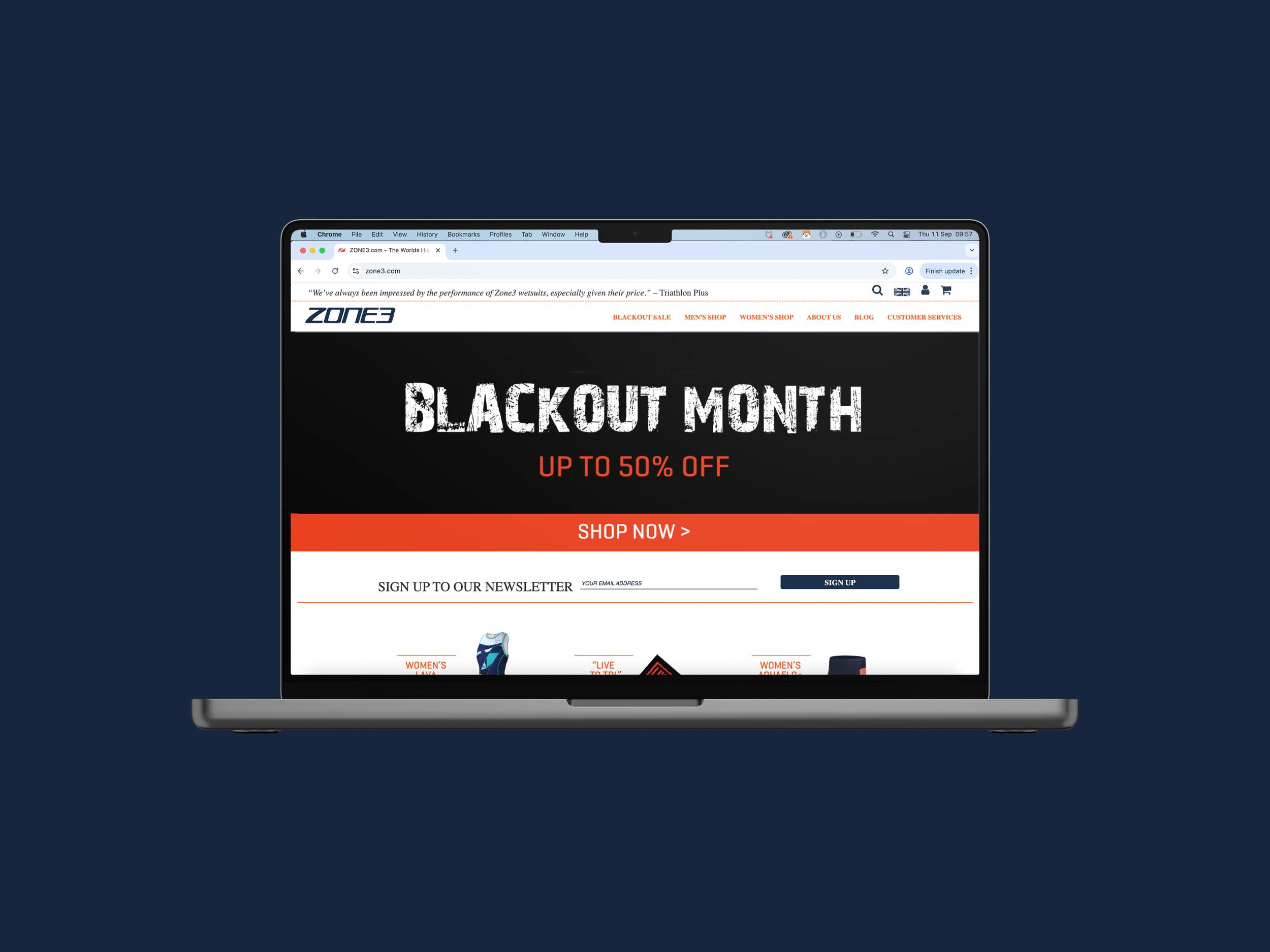
The 'Blackout' campaign, originally conceived by the brand manager, was based on a competitor brand’s most successful global campaign of 2017. In an effort to align with this success, we chose to retain the name Blackout for our campaign. Although I proposed the alternative name 'Splashout'—a clever play on the swimming segment of the triathlon and the notion of spending money—this suggestion was ultimately not accepted.
This was my final campaign during my time at Zone3, so I decided to incorporate some animation to add a creative flair and make it more eye-catching for customers. The subtle movement not only enhanced the visual appeal but also helped to draw attention in a crowded marketplace, making the messaging more memorable. By blending animation with the core design elements, the campaign achieved a dynamic and engaging presence while maintaining the brand’s overall tone and style.
Merlin Power Marketing Campaigns
Merlin Power are committed to delivering reliable, high-performance power systems to emergency services, the RNLI, defence vehicles and more. Through a series of marketing campaigns that spanned across social media marketing, video marketing, and influencer marketing, we increased brand awareness, social media followers and trust.
Spring Into Action Sale
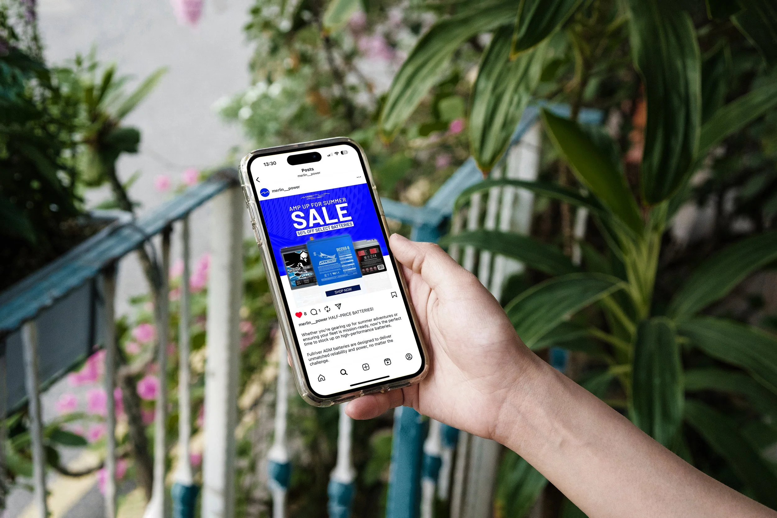
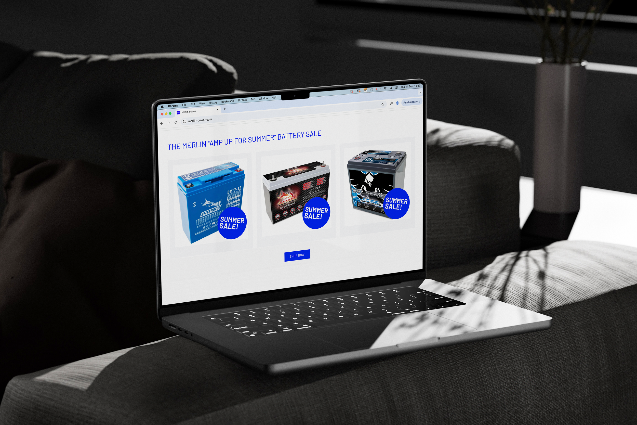
Merlin Power's most successful marketing campaign in their 30+ year history is the Spring Into Action sale. Initiated by the General Manager in Spring 2025, this campaign was designed to sell as many Fullriver batteries as possible from existing 'dead stock' and non-moving inventory. The sale is still ongoing, reflecting its sustained impact on stock clearance. All campaign graphics were created by myself in-house, ensuring a consistent and professional brand presentation. As the sale continues, final sales figures are not yet available.
The campaign assets, all created by myself, include a targeted email campaign, multiple social media posts, copywriting, email segments, product flags, website banners, email signatures and more. Each element has been carefully crafted to ensure consistency and effectiveness across all channels, driving engagement and brand awareness. The cohesive design and messaging support the overall campaign goals, enhancing customer experience and fostering stronger connections.
Influencer Marketing
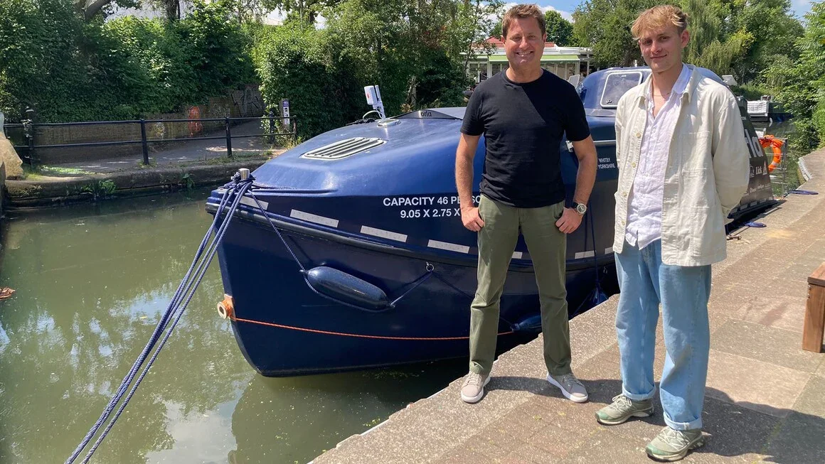
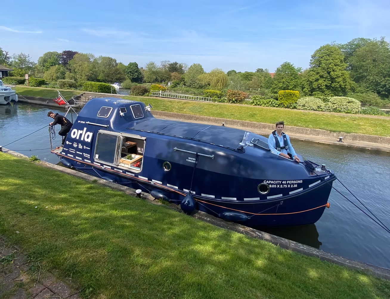
Johnny Sturgeon, an innovative boatbuilder, embarked on an ambitious project to transform a decommissioned lifeboat into a fully functioning floating home named Orla. Combining creativity, sustainability, and craftsmanship, Johnny successfully breathed new life into the marine vessel, turning it into a unique residential space.
Designing the marine electrical system for Orla presented distinct challenges, particularly given the vessel’s repurposed nature. Key requirements included:
A dependable power source capable of supporting a variety of onboard uses, from lighting and appliances to essential systems.
Battery monitoring to prevent overcharging or deep discharging, essential for maximising battery longevity and reliability.
Safe, compliant installations to reduce the risk of electrical faults and ensure adherence to marine safety standards.
A durable, future-proof setup designed to withstand continuous residential use and adapt to potential future upgrades.
Johnny’s project not only showcased technical innovation but also highlighted sustainable practices in marine repurposing. His detailed user-generated content documenting the transformation significantly boosted our social media presence, engaging a wider audience with this inspiring story.
Later, Johnny’s work caught the attention of a broader public when he appeared on Channel 4’s George Clarke’s Amazing Spaces, sharing the journey of Orla and the challenges of converting a lifeboat into a home.
